Figma, Photoshop.
visit site: https://www.instagram.com/guga.architectureContext: Architecture Firm wanted to redo their Instagram account to act as a ‘first touch’ or secondary portfolio. Less concerned with engagement and more with brand identity.
As firm is aligned with artists and exploratory thinking, they wanted to break out of the stale conventions of social media.
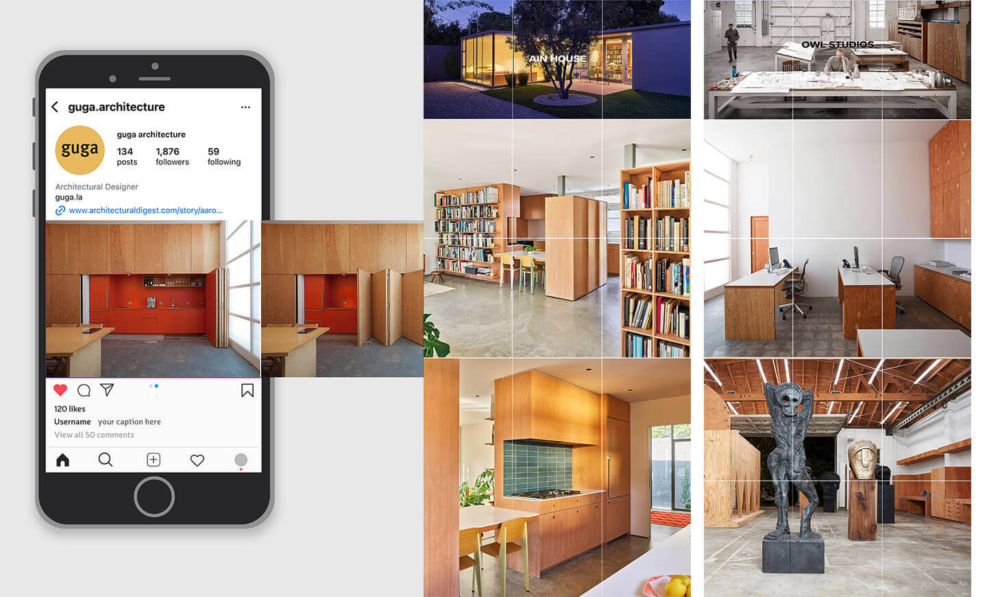
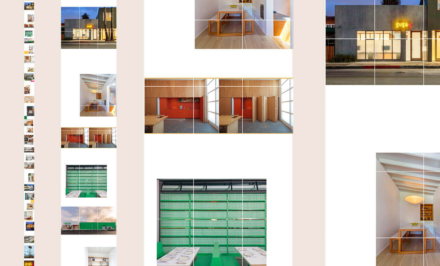
The problem: Architectural photography is usually best shown in landscape ratio, diametrically opposed to the vertical format of Instagram. Client wanted to be able to feature a range of photography to convey the firm’s work.
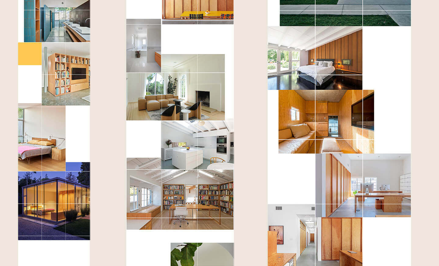
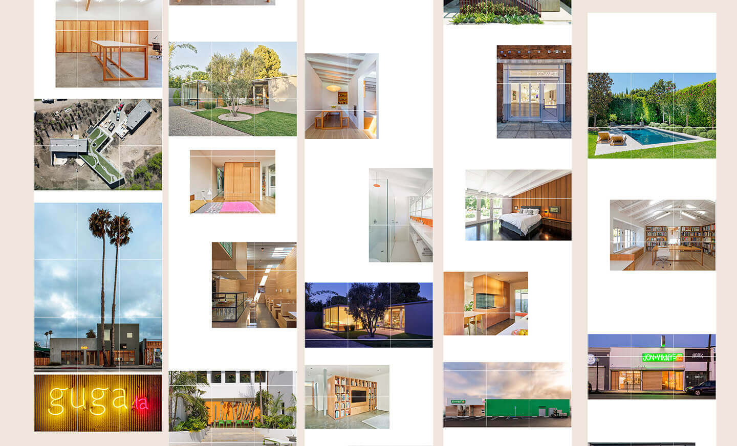
The solution: Use the entire feed grid as a an editorial style layout, with variations of groupings, white space, overlap, and narrative themes explored to convey the aesthetic of the firm.
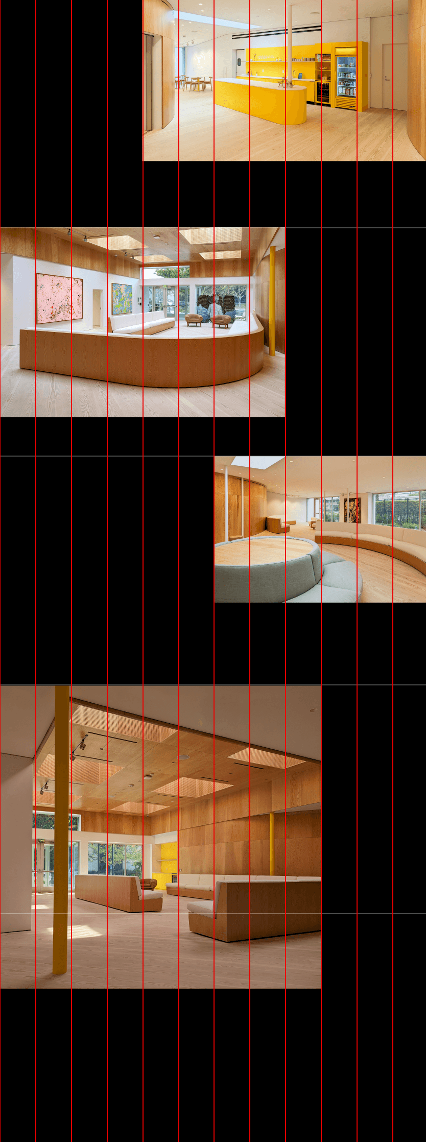
I developed a modular grid system (a 12 column grid over Instagram’s 3 column grid) that allowed the use of photography in various aspect ratios, from wide landscape to tall verticals and nearly everything in between to properly showcase the work.
Feed grid is complemented with a strategy of reels and carousels to increase engagement and reinforce the branding and introduce new narratives.